Finance

Quirkyjournals.com — Personal finance insights, money management basics & simplified financial education. Not financial advice.

A modern editorial-style illustration of a person at an online checkout page, hesitating before clicking “buy now,” while translucent thought bubbles around them show emotional triggers like stress, boredom, and FOMO. Behind them, subtle infographic elements display cognitive biases such as “anchoring,” “scarcity,” and “present bias,” with arrows connecting each trigger to an impulse purchase. Clean, high-contrast design with calming blue tones and bright caution accents, 16:9 aspect ratio, suitable as a blog header for an article on emotional spending audits and behavioural finance.

Your Brain is Wired to Overspend: Here’s How to Outsmart It

Emotional spending is rarely about the item itself; it is usually about the mood, trigger, or bias that pushed the purchase decision over the line. This guide uses behavioural finance to show how impulse buys happen, why your brain is wired for them, and how an emotional spending audit can help you spot the patterns that keep draining your money.

Your Brain is Wired to Overspend: Here’s How to Outsmart It Read More »

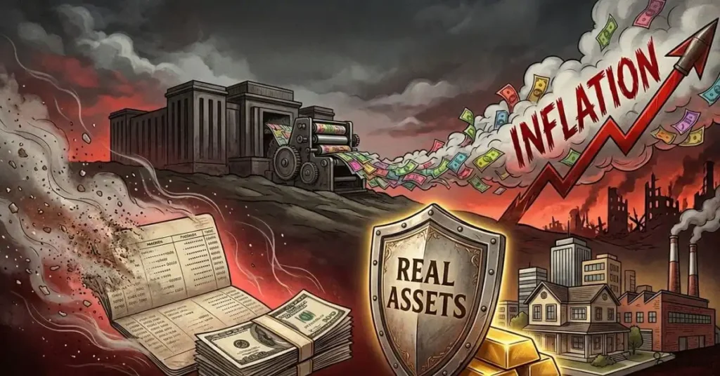
A symbolic illustration of a household’s finances under war stress: a savings book and cash stack fading into dust on the left, while on the right, physical assets like gold bars, real estate, and a factory remain solid behind a shield labeled “real assets.” In the background, government buildings and a printing press emit clouds of inflated currency notes, and a rising inflation arrow overlays a war‑zone skyline. Moody, high‑contrast style with deep reds, grays, and gold accents, 16:9 aspect ratio, ideal as a chapter header image for “Why Savings Get Destroyed Faster Than Assets” in a war‑economy book.

War Economy Chapter 20: Why Savings Are Destroyed First

War does not just destroy infrastructure—it silently destroys savings. Governments under war finance needs tend to tax, borrow, and, most damagingly, print money, which erodes the value of cash, deposits, and fixed‑income assets far faster than physical assets like land, real estate, gold, or productive businesses. This chapter explains the three‑channel war‑finance model (taxation, borrowing, money printing), shows how inflation systematically penalizes savers, and outlines what history teaches about protecting wealth when the state’s money creation outpaces the real economy.

War Economy Chapter 20: Why Savings Are Destroyed First Read More »

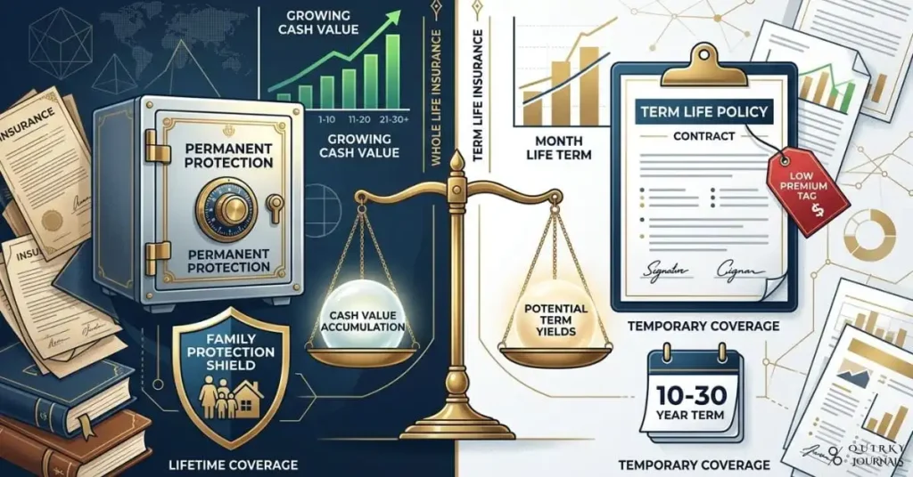
A sophisticated financial comparison illustration split down the middle: on the left, a whole life insurance policy represented by a polished vault, a growing cash value chart, and a family protection shield; on the right, a term life policy shown as a clean, simple contract with a low premium tag and a calendar icon. Between them, a balanced scale highlights “cash value” versus “term yields,” with subtle market charts and insurance documents in the background. Professional, editorial style with deep navy, gold, and white tones, 16:9 aspect ratio, ideal as a blog header for an article auditing whole life insurance versus term insurance.

Cash Value vs Cheap Coverage: Reassessing Whole Life Insurance

Whole life insurance is often sold as a dual-purpose product: protection for your family and a guaranteed cash value asset you can use while alive. Term insurance, by contrast, is simple and inexpensive, offering pure death benefit protection for a fixed period with no cash value at all. This audit compares the mechanics, costs, risks, and likely outcomes of both approaches so you can judge whether whole life’s guarantees are worth the premium—or whether term and investing the difference is the better fit for your goals.

Cash Value vs Cheap Coverage: Reassessing Whole Life Insurance Read More »

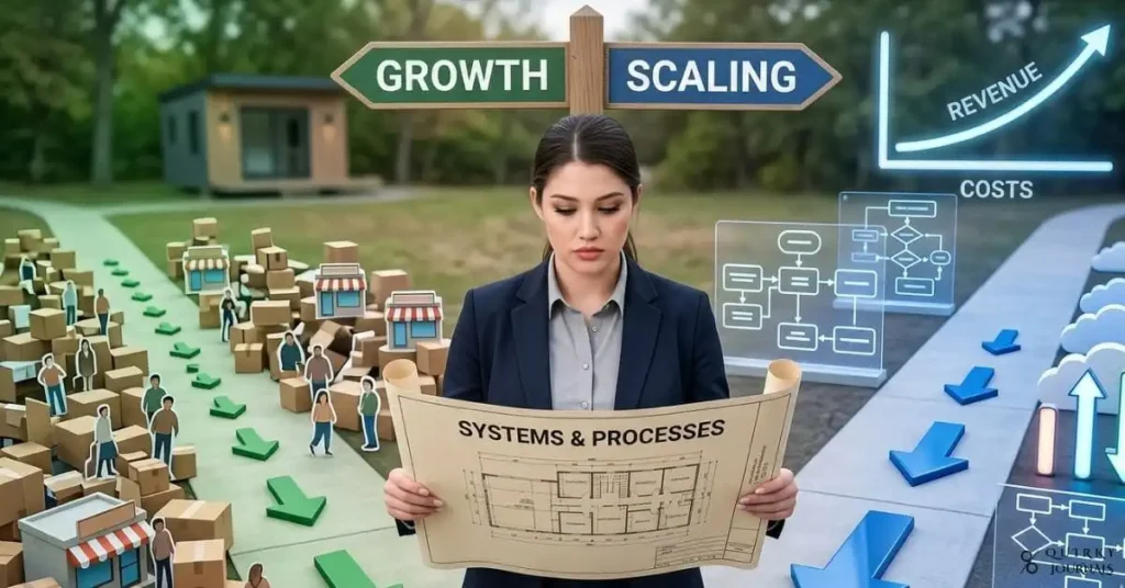
A clean, modern illustration showing two paths diverging from a small business: on the left, a “growth” path with people, locations, and inventory icons piling up in a messy, crowded style; on the right, a “scaling” path with streamlined workflow diagrams, automated processes, cloud icons, and a clean revenue curve rising above costs. A founder stands at the split, holding a blueprint labeled “systems and processes,” with subtle arrows pointing toward efficiency and leverage. Professional, high‑contrast design with blue and green tones, 16:9 aspect ratio, ideal as a blog header for an article on growth vs scaling and building systems for rapid expansion.

From Startup Growth to Scaling: A Practical Guide for Businesses

Growth and scaling both look like progress, but only scaling turns revenue into leverage. Growth means adding more people, locations, and costs to generate more output, while scaling means building systems and processes that let revenue rise faster than costs. This guide explains the difference in plain terms, shows why scaling needs deliberate system‑building, and gives practical steps to prepare your business for rapid, sustainable expansion.

From Startup Growth to Scaling: A Practical Guide for Businesses Read More »

A cinematic, high-detail illustration of a dark, server-filled data center on one side, with streams of raw tick data flowing like jagged neon lines, and on the other side, a clean trading dashboard where the same data has been compressed into smooth OHLC candlestick charts and RSI and moving average lines. In the middle, a magnifying glass traces over the candles, with visible “signals” highlighted as glowing arrows pointing up or down. Deep blue and electric green color palette, futuristic but realistic, 16:9 aspect ratio, ideal as a blog header for an article on how algorithms “see” the market by turning noise into signals.

How Algos “See” the Market: Signal Hunting Explained

Algorithms don’t trade raw chaos—they trade distilled signals. Every second, markets generate a flood of tick data, order-book movements, and trades, but an algo “sees” only the patterns extracted from that noise. This guide explains how raw tick streams are turned into OHLC bars, how indicators like moving averages and RSI pull trends and momentum out of the chaos, and how modern algos detect signals that human traders would miss in the noise.

How Algos “See” the Market: Signal Hunting Explained Read More »

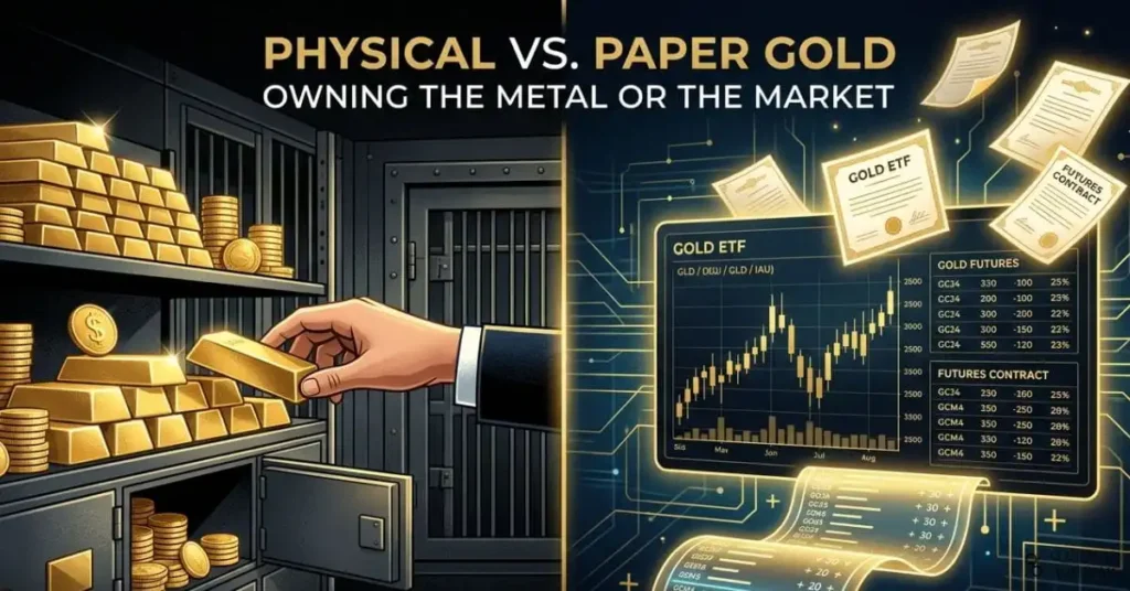
A refined editorial-style illustration showing two sides of the gold market: on the left, stacked gold coins and bullion bars in a secure vault with a hand reaching toward them; on the right, a digital trading screen displaying a gold ETF chart, futures contracts, and abstract paper certificates floating above a glowing ledger. A subtle visual divide runs between the two halves to emphasize direct ownership versus financial exposure. Premium, high-contrast design with gold, black, and deep blue tones, 16:9 aspect ratio, suitable as a blog header for an article comparing paper gold and physical gold.

Why Physical Gold and Paper Gold Are Not the Same Investment

Gold investors often assume all gold exposure is the same, but paper gold and physical gold work in very different ways. This guide explains the key differences between gold ETFs, futures, unallocated accounts, allocated vault storage, and physical bullion so you can understand ownership, liquidity, counterparty risk, and crisis protection before choosing the right form of gold exposure.

Why Physical Gold and Paper Gold Are Not the Same Investment Read More »

A modern, editorial-style illustration of a person standing at a crossroads with several faded paths labeled “side hustle,” “passive income,” and “new project,” while one bright, highlighted path in the center is labeled “Focus and Scale.” In the foreground, a clean dashboard shows a single income stream growing steadily upward, with subtle icons for skill-building, systems, and client trust. Minimalist professional design with blue, green, and gold tones, 16:9 aspect ratio, suitable as a blog header for an article on sustainable income growth and mastering one income stream first.

Stop Diversifying, Start Mastering One Income Stream Before You Expand

Trying to build multiple income streams too early often leads to scattered effort, weak results, and burnout instead of real progress. This 4-step framework flips the usual advice by showing why you should first focus and master one income stream, then stabilise, optimise, and only after that diversify. The result is a more sustainable path to income growth, stronger client trust, and compounding returns from focused effort.

Stop Diversifying, Start Mastering One Income Stream Before You Expand Read More »

A polished editorial-style illustration of a large stablecoin coin sitting on a legal document labeled “GENIUS Act,” with visible cracks around the edges to symbolize unresolved risks. Surrounding the coin are floating icons for AML checks, foreign flag markers, DeFi nodes, audit reports, and compliance warning symbols, while a background of regulatory buildings and blockchain network lines suggests policy complexity. Clean, modern, high-contrast style with blue, white, and caution-red accents, 16:9 aspect ratio, suitable as a blog header for an article about the GENIUS Act’s unresolved stablecoin risks.

5 Stablecoin Risks the GENIUS Act Left Open

The GENIUS Act was sold as the answer to stablecoin chaos, but the legislation leaves major risks unresolved. From AML gaps and regulatory arbitrage to foreign issuer loopholes, DeFi exposure, and compliance burdens that smaller firms may struggle to absorb, this guide explains the five biggest problems the law still does not fix. If you work in crypto, compliance, fintech, or policy, understanding these gaps is essential before treating the GENIUS Act as a finished solution.

5 Stablecoin Risks the GENIUS Act Left Open Read More »

A high-detail illustration of two hands meeting in a “digital handshake”: on the left, a human hand in a business shirt sleeve, and on the right, a glowing polygonal/wireframe hand made of data lines and code. Behind them, large transparent screens show candlestick charts, order books, and lines of algorithm code scrolling vertically. The setting is a modern trading floor with blurred figures and monitors in the background. Cool blue and teal color palette with subtle neon accents, 16:9 aspect ratio, suitable as a hero image for an article introducing algorithmic trading.

The Rise of the Machines: What Algorithmic Trading Really Does

Financial markets are no longer moved only by human traders shouting orders on a floor—they are increasingly shaped by code executing in microseconds. Algorithmic trading uses predefined rules and models to scan markets, place orders, and manage risk at speeds and scales humans cannot match, reshaping how liquidity, volatility, and opportunity work across asset classes. This guide explains what algo trading is, how it works in practice, its core benefits and risks, and what beginners need to understand before letting a “digital handshake” trade on their behalf.

The Rise of the Machines: What Algorithmic Trading Really Does Read More »

A clean, modern flat-lay of a workspace showing a laptop with a dashboard of colorful financial charts and ratios, a notepad with hand-written formulas like “Savings Ratio” and “Debt-to-Income,” a calculator, and a cup of coffee on a wooden desk. Subtle icons representing money (piggy bank, coins, bar charts, pie charts) are integrated into the scene. Bright, optimistic color palette with blues and greens, minimalistic and professional, 16:9 aspect ratio, suitable as a header image for a personal finance blog explaining key money ratios.

The 11 Money Ratios That Reveal Your True Financial Health

Most people judge their money by gut feel instead of hard data, which is why problems like hidden debt, weak savings, and stalled progress show up too late. Personal finance ratios fix that by turning your income, expenses, debt, and savings into clear metrics you can track and improve. This guide walks through 11 essential ratios—formulas, ideal ranges, and real-world use cases—so you can quickly see where you stand and what to fix next on your path to financial stability and freedom.

The 11 Money Ratios That Reveal Your True Financial Health Read More »