
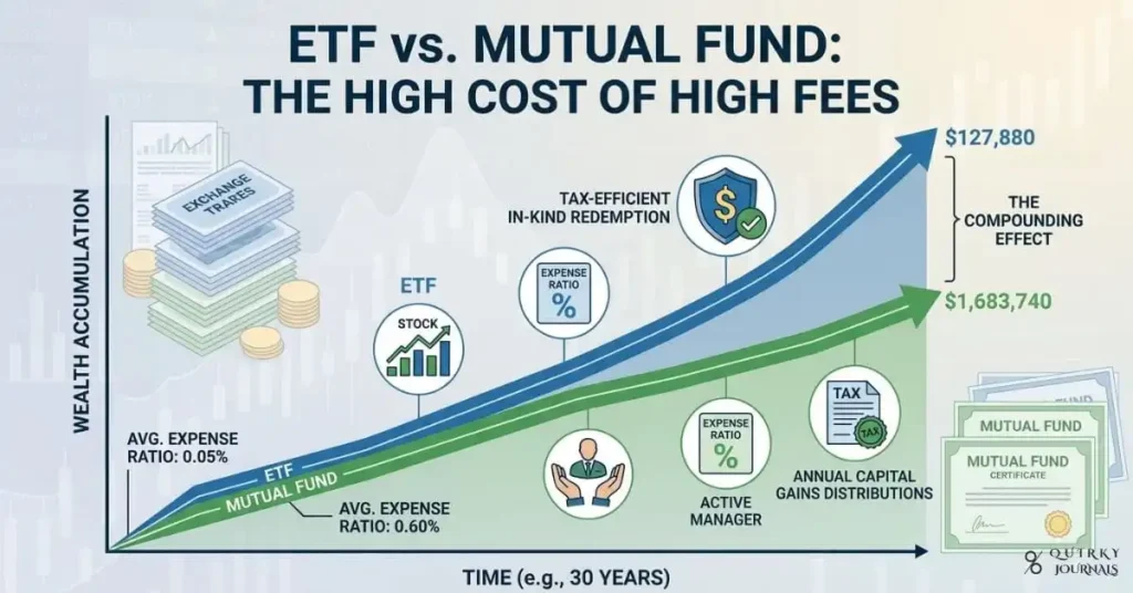
A clean, data‑driven illustration showing two parallel paths rising over time, labeled “ETF” and “Mutual Fund,” with small fee percentages (e.g., 0.05% vs 0.60%) at the base and the final wealth values at the end of the line significantly diverging, emphasizing compounding. Overlay icons for stock indices, expense‑ratio percentages, and subtle tax‑efficiency symbols, with a muted background of market charts and fund shares. Professional, modern design with blue and green tones, 16:9 aspect ratio, ideal as a blog header for an article on ETF vs. mutual fund expense ratios and long‑term growth.

ETF vs. Mutual Fund: Minimising Fees for Maximum Growth

ETFs and mutual funds can both track the same index, but the ETF vs. mutual fund duel turns into a long‑term wealth fight where the quieter winner is usually the one with the lower expense ratio. This guide compares the fee structures, tax efficiency, and compounding effects of ETFs and mutual funds so you can see how small differences in costs add up to tens or even hundreds of thousands of dollars over decades.

ETF vs. Mutual Fund: Minimising Fees for Maximum Growth Read More »