
Investing

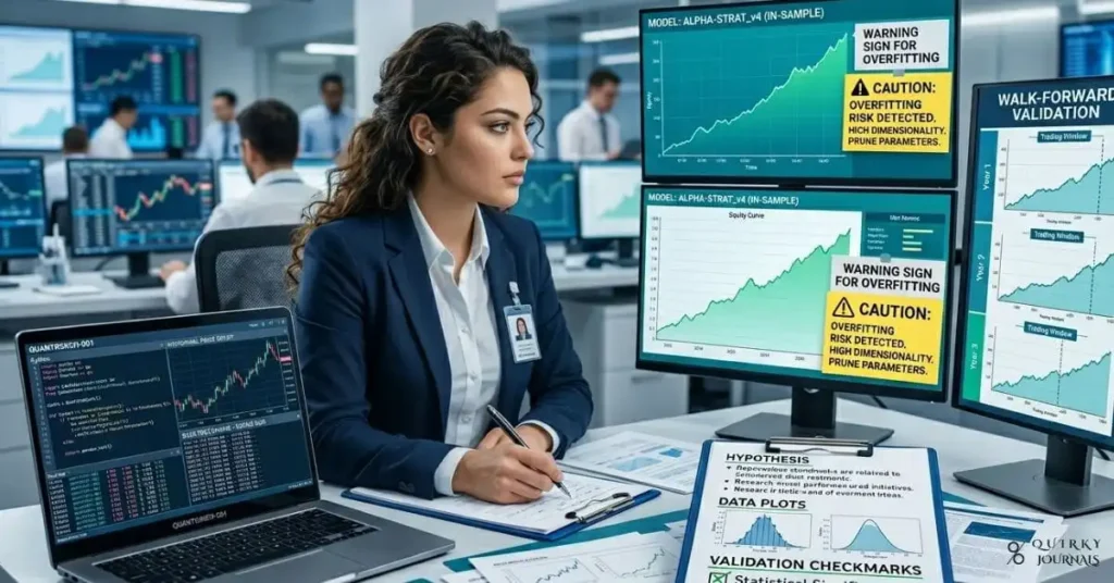
A sleek, ultra-modern trading floor bathed in cool blue and electric green lighting, with towering curved monitors displaying cascading financial data, mathematical equations, and real-time stock charts. In the foreground, a glowing neural network diagram merges with stock market candlestick patterns. The atmosphere is high-tech and cinematic, evoking precision, machine intelligence, and Wall Street power. Style: photorealistic digital art, dramatic depth of field, dark background with neon data highlights. Aspect ratio: 16:9.

Quantitative Trading Explained: What Is a Quant Firm?

Most people have never heard of a quant firm — yet these math-driven organisations quietly influence the price of nearly every stock, bond, and currency on earth. This guide breaks down exactly what quant firms are, how systematic trading works, and why understanding them matters for anyone serious about modern financial markets.

Quantitative Trading Explained: What Is a Quant Firm? Read More »

Managing Startup Finances Cash Flow, Burn Rate, and Runway

Startup Cash Flow, Burn Rate and Runway Explained

Most startups do not die from a lack of ideas—they die from a lack of cash. Understanding exactly how money moves through your business, how fast you are burning it, and how many months of runway you have left is what separates founders who can course-correct from those who hit the wall by surprise. This guide breaks down cash flow, burn rate, and runway in plain language, shows you how to calculate each with simple formulas, and outlines practical steps to extend your survival time without starving your growth.

Startup Cash Flow, Burn Rate and Runway Explained Read More »

A clean, data‑driven illustration showing two parallel paths rising over time, labeled “ETF” and “Mutual Fund,” with small fee percentages (e.g., 0.05% vs 0.60%) at the base and the final wealth values at the end of the line significantly diverging, emphasizing compounding. Overlay icons for stock indices, expense‑ratio percentages, and subtle tax‑efficiency symbols, with a muted background of market charts and fund shares. Professional, modern design with blue and green tones, 16:9 aspect ratio, ideal as a blog header for an article on ETF vs. mutual fund expense ratios and long‑term growth.

ETF vs. Mutual Fund: Minimising Fees for Maximum Growth

ETFs and mutual funds can both track the same index, but the ETF vs. mutual fund duel turns into a long‑term wealth fight where the quieter winner is usually the one with the lower expense ratio. This guide compares the fee structures, tax efficiency, and compounding effects of ETFs and mutual funds so you can see how small differences in costs add up to tens or even hundreds of thousands of dollars over decades.

ETF vs. Mutual Fund: Minimising Fees for Maximum Growth Read More »

A futuristic financial-tech illustration showing a humanoid robot standing on a glowing stock market floor with ascending chart lines behind it, while holographic labels highlight parts of the robot value chain such as chips, sensors, actuators, batteries, and software. In the background, subtle silhouettes of factories, warehouses, and logistics hubs suggest real-world deployment, and a “Humanoid 100” style dashboard floats nearby with stock icons and performance graphs. Clean, premium, cinematic style with cool metallic blues, silver, and electric orange accents, 16:9 aspect ratio, ideal as a blog header for an article about humanoid robot stocks beyond Nvidia.

Beyond Nvidia: Why Humanoid Robot Stocks Are Taking Off

The next major AI investing theme may not be another chip race, but the companies building the physical machines that use those chips. Morgan Stanley’s Humanoid 100 highlights 100 businesses across the humanoid robot value chain, from semiconductors and sensors to full robot assembly, and shows how investors can look beyond Nvidia to find new winners. This guide explains what the Humanoid 100 is, why humanoid robots are becoming a serious market opportunity, and what risks investors should consider before betting on the sector’s long-term growth.

Beyond Nvidia: Why Humanoid Robot Stocks Are Taking Off Read More »

A realistic, editorial-style scene of a trading desk with two large monitors: one showing the VIX spiking above 25 with red volatility charts, the other displaying stock charts and logos for CBOE and Lockheed Martin trending upward. In the background, a world map highlights the Middle East with warning icons over key shipping lanes, and an oil tanker silhouette next to a fighter jet suggests energy and defense risk. Cool, tense color palette (deep blues and reds), high contrast, 16:9 aspect ratio, suitable as a feature image for an article on using CBOE and LMT as volatility hedges amid geopolitical escalation.

How CBOE and Lockheed Martin Became Geopolitical Hedges

With war risk rising and energy routes under threat, investors in 2026 are not just buying gold or Treasuries—they are hedging volatility itself and the companies that profit from it. CBOE, which earns more as index options and VIX trading surge, and Lockheed Martin, a prime beneficiary of expanding defense budgets, have both outperformed as geopolitical tensions escalate and the VIX pushes into a sustained high‑vol regime above 25. This article explains why these two tickers have become go‑to portfolio shock absorbers, how they behave when fear spikes, and what risks still come with treating them as volatility hedges.

How CBOE and Lockheed Martin Became Geopolitical Hedges Read More »

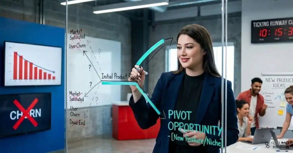
A modern, high‑contrast illustration of a startup growth “war room”: a small diverse team of founders gathered around a large screen showing a funnel dashboard labeled AARRR (Acquisition, Activation, Retention, Revenue, Referral), with charts trending upward and sticky notes marking experiments. Laptop screens show graphs, experiment ideas, and a kanban board labeled “Growth Experiments.” The environment is a minimalist tech office at night with city lights outside, giving a sense of urgency and focus. Color palette of deep blues and purples with neon accents (teal and orange) to convey innovation and speed. Clean, semi‑realistic style, 16:9 aspect ratio, ideal as a blog header for an article on startup growth hacking and scalable customer acquisition in 2026.

Startup Growth Hacking: Scalable Customer Acquisition That Works

When your runway is shrinking and user growth is flat, “do more marketing” is not a strategy—it is a slow path to running out of cash. Growth hacking gives founders a disciplined, experiment-driven way to find scalable customer acquisition channels that actually work in 2026, from product-led growth and viral loops to content SEO, outbound, and partnerships. This guide breaks down the growth hacking mindset, the AARRR framework, and the core acquisition playbooks you can test, along with the metrics that prove what is working so you can double down with confidence.

Startup Growth Hacking: Scalable Customer Acquisition That Works Read More »

A cinematic financial illustration of a gold bar and gold coin stack sitting in the foreground while red market charts and a volatility dashboard flash behind it. In the background, a stormy geopolitical scene with headlines about war and inflation contrasts with a rising U.S. dollar symbol and Treasury yield curve, suggesting that gold is falling despite panic. Include subtle sell-off cues like traders liquidating positions and a cracked “safe haven” label. Dramatic, high-contrast lighting with gold, black, and deep red tones, 16:9 aspect ratio, suitable as a blog header for an article about why gold prices are falling in 2026.

Why Gold Prices Are Falling in 2026

Gold’s 2026 drop is confusing only if you assume “risk-off” always means “gold up.” In March, rising Treasury yields, a stronger U.S. dollar, profit-taking after a crowded bull run, and forced liquidity selling overwhelmed safe-haven demand even as geopolitics worsened. This guide explains why gold can fall during market volatility, what the March 2026 sell-off says about investor positioning, and how to think about gold’s role in a macro environment where inflation, rates, and cash needs can matter more than fear alone.

Why Gold Prices Are Falling in 2026 Read More »

A dramatic financial-tech illustration showing a glowing AI model pipeline in the center, with the key-value cache highlighted as shrinking from large memory blocks into tiny compressed cubes labeled “3 bits.” On the left, a stock market chart for memory chip companies plunges sharply in red, while on the right, chip packages and RAM modules appear cracked or fading into the background. A subtle Google-style research lab silhouette and a headline overlay reading “TurboQuant” create a sense of shock and breakthrough. High-contrast, cinematic lighting, red and blue color palette, 16:9 aspect ratio, ideal as a blog header for an article about the Google TurboQuant memory market sell-off.

A $450 Billion Blow: RAM Markets Plummet 30% Following Google’s TurboQuant Reveal

Google’s TurboQuant sent shockwaves through memory markets by promising to cut the key-value cache needed for LLM inference to just 3 bits, triggering a brutal sell-off across chipmakers and wiping hundreds of billions from semiconductor valuations. This article explains what TurboQuant actually does, why investors panicked so fast, and whether the market reaction reflects a real long-term threat or just a cyclical overreaction. It also breaks down the key-value cache bottleneck, the role of HBM demand, and what this could mean for AI infrastructure spending going forward.

A $450 Billion Blow: RAM Markets Plummet 30% Following Google’s TurboQuant Reveal Read More »

A clean, infographic-style illustration showing a central formula block labeled “Retirement Nest Egg = Annual Income Needed ÷ Safe Withdrawal Rate,” with three supporting panels around it: one labeled “Step 1: Estimate Annual Retirement Income” showing a sample budget; one labeled “Step 2: Choose a Withdrawal Rate (3–4%)” with a dial at 4%; and one labeled “Step 3: Let Compound Interest Work” with a rising curve over 30 years. Soft blues and greens, simple icons for a house, groceries, and healthcare, 16:9 aspect ratio, suitable as a header image for a retirement calculator guide.

Retirement Calculator Formula: How to Estimate Your Future Needs

Most people know they should “save for retirement,” but few can translate that into a clear number and monthly target. A simple retirement calculator formula changes that by turning fuzzy goals into concrete estimates based on income, spending needs, inflation, investment returns, and the famous 4% rule. This guide walks you through the core nest-egg formula, shows how to estimate your annual retirement income, and explains how compounding and inflation shape the amount you really need to retire with confidence.

Retirement Calculator Formula: How to Estimate Your Future Needs Read More »